Create a dual axis map in Tableau
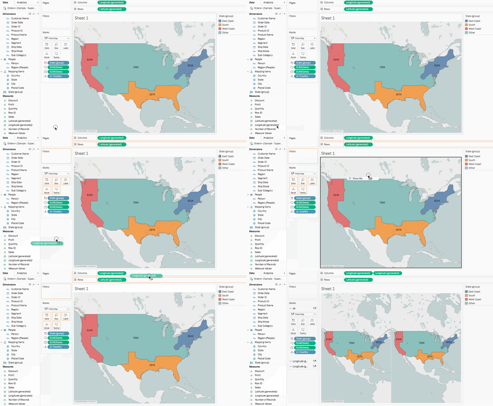
From the Data pane, drag Longitude (generated) to the Columns shelf and place it to the right of the first Longitude field.
The view updates with two identical maps.

There are now three tabs on the Marks card: one for each map view, and one for both views (All). You can use these to control the visual detail of the map views. The top Longitude tab corresponds to the map on the left of the view, and the bottom Longitude tab corresponds to the map on the right of the view.

On the Marks card, select the top Longitude (generated) tab.
From Measures, drag Sales to Coloron the top Longitude (generated) Marks card.
The map on the left updates.
On the top Longitude (generated) Marks card, click the + icon on the Country field to drill back down to the State level of detail.
On the Marks card, click Color, and then select Edit Colors.
In the Edit Colors dialog box that opens, click the Palette drop-down, select Gray, and then click OK.
At this point, your maps look like this:

On the Columns shelf, right-click the Longitude (generated) field on the right and select Dual Axis.

On the Marks card, select the bottom Longitude (generated) tab.
On the bottom Longitude (generated) Marks card, drag both SUM(Sales) fields from the view to remove them.
The labels for each map no longer overlap.
On the bottom Longitude (generated) Marks card, click Color, and then, for Opacity, enter 50%.
This is a crucial step if you want to be able to see the map on the bottom layer.
The map view updates to look like this:

You can now see how each state performed within each group.
On the bottom Longitude (generated) Marks card, click Tooltip.
An Edit Tooltip dialog box opens.
Copy the following text and paste it into the Edit Tooltip dialog box, and then click OK:
Total <State (group)> region sales: <SUM(Sales)>
The tooltip looks similar to this:

To learn more about important mapping concepts from Tabeau: https://help.tableau.com/current/pro/desktop/en-us/maps_build.htm
Comments
Post a Comment